class: center, middle, inverse, title-slide # DSBA 5122: Visual Analytics ## Class 5: Distributions and Uncertainty ### Ryan Wesslen ### September 23, 2019 --- class: center, middle, inverse # Why view Distributions? Cairo Ch. 7 & Wilke Ch. 7 - 9 <img src="../images/slides/01-class/DataSaurusDozen.gif" width="600px" style="display: block; margin: auto;" /> --- class: center, middle .pull-left[ <img src="../images/slides/05-class/cairo.png" width="300px" style="display: block; margin: auto;" /> ] -- .pull-right[ <img src="../images/slides/05-class/cairo2.png" width="280px" style="display: block; margin: auto;" /> ] --- class: center, middle <img src="../images/slides/05-class/cairo3.png" width="600px" style="display: block; margin: auto;" /> --- class: center, middle <img src="../images/slides/05-class/wilke1.png" width="700px" style="display: block; margin: auto;" /> --- class: center, middle <img src="../images/slides/05-class/wilke2.png" width="700px" style="display: block; margin: auto;" /> --- class: center, middle <img src="../images/slides/05-class/wilke3.png" width="700px" style="display: block; margin: auto;" /> --- class: center, middle <img src="../images/slides/05-class/wilke4.png" width="700px" style="display: block; margin: auto;" /> --- class: center, middle <img src="../images/slides/05-class/wilke5.png" width="700px" style="display: block; margin: auto;" /> --- class: center, middle <img src="../images/slides/05-class/wilke6.png" width="500px" style="display: block; margin: auto;" /> --- class: center, middle <img src="../images/slides/05-class/wilke7.png" width="500px" style="display: block; margin: auto;" /> --- class: center, middle .pull-left[ ```r ggplot(df, aes(x, y)) + geom_boxplot() ``` ] .pull-right[ ```r ggplot(df, aes(x, y)) + geom_violin() ``` ] <img src="../images/slides/05-class/wilke9.png" width="700px" style="display: block; margin: auto;" /> --- class: center, middle <img src="../images/slides/05-class/wilke10.png" width="700px" style="display: block; margin: auto;" /> --- class: center, middle <img src="../images/slides/05-class/wilke11.png" width="700px" style="display: block; margin: auto;" /> --- class: center, middle <img src="../images/slides/05-class/wilke12.png" width="700px" style="display: block; margin: auto;" /> --- class: center, middle <img src="../images/slides/05-class/wilke13.png" width="700px" style="display: block; margin: auto;" /> [`ggridges` examples](https://cran.r-project.org/web/packages/ggridges/vignettes/gallery.html) --- class: center, middle <img src="../images/slides/05-class/wilke14.png" width="700px" style="display: block; margin: auto;" /> [`ggridges` examples](https://cran.r-project.org/web/packages/ggridges/vignettes/gallery.html) --- class: center, inverse, middle ## Uncertainty: Cairo Ch. 10 & Wilke Ch. 16 <img src="../images/slides/05-class/xkcd.png" width="400px" style="display: block; margin: auto;" /> xkcd --- class: center, middle <img src="../images/slides/05-class/cairo4.png" width="700px" style="display: block; margin: auto;" /> --- class: center, middle <img src="../images/slides/05-class/cairo5.png" width="650px" style="display: block; margin: auto;" /> --- class: center, middle <img src="../images/slides/05-class/cairo6.png" width="550px" style="display: block; margin: auto;" /> --- class: center, middle <img src="../images/slides/05-class/cairo7.png" width="500px" style="display: block; margin: auto;" /> --- ## Bootstrapping: Within ggplot2 ```r organdata %>% ggplot(aes(x = country, y = donors)) + {{stat_summary(fun.y = mean, geom = "point", size = 3) +}} * stat_summary(fun.data = mean_cl_boot, geom = "errorbar", width = 0.5) + coord_flip() + cowplot::theme_cowplot() + labs(x = " ", y = "Organ Donations in 000's", title = "Avg Organ Donations (000s) by Country") ``` 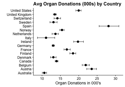<!-- --> <https://rstudio.cloud/spaces/22733/project/527500> --- ## Bootstrapping: Outside ggplot2 ```r organdata %>% group_by(country) %>% {{do(as_tibble(bind_rows(Hmisc::smean.cl.boot(.$donors)))) %>%}} # bootstrapping by country ggplot(aes(x = reorder(country, Mean), y = Mean)) + {{geom_point(size = 3) + }} # Plot means as geom_point geom_errorbar(aes(ymin = Lower, ymax = Upper), width = 0.5) + # Error as geom_errorbar coord_flip() + cowplot::theme_cowplot() + labs(x = " ", y = "Organ Donations in 000's", title = "Avg Organ Donations (000s) by Country") ``` 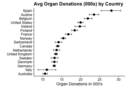<!-- --> <https://rstudio.cloud/spaces/22733/project/527500> --- # Bootstrapping with HOPs + `gganimate` 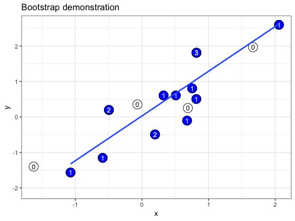<!-- --> [`ungeviz` package by Claus Wilke](https://wilkelab.org/ungeviz/articles/sampling-bootstrapping.html) --- # Unemployment Rate ```r df %>% ggplot(aes(x = date, y = unemployment)) + geom_line() + coord_cartesian(ylim = c(0, .11), expand = FALSE), scale_y_continuous(labels = scales::percent) + labs(x = NULL, y = NULL, subtitle = "US unemployment over time") ``` 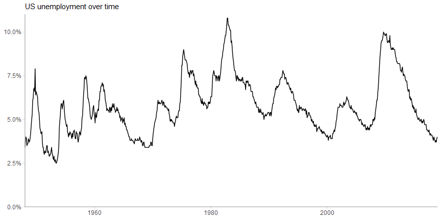<!-- --> --- # Unemployment Rate .center2[ <img src="../../images/slides/05-class/01-unemp-blog.png" width="800px" style="display: block; margin: auto;" /> ] [Kay and Hullman Multiple Views Blog 1](https://medium.com/multiple-views-visualization-research-explained/uncertainty-visualization-explained-67e7a73f031b) --- # Types of Uncertainty: Reducible and Irreducible .center2[ <img src="../../images/slides/05-class/02-unemp-blog.png" width="800px" style="display: block; margin: auto;" /> ] .center2[ <img src="../../images/slides/05-class/03-unemp-blog.png" width="800px" style="display: block; margin: auto;" /> ] [Kay and Hullman Multiple Views Blog 1](https://medium.com/multiple-views-visualization-research-explained/uncertainty-visualization-explained-67e7a73f031b) --- # Unemployment Rate .center2[ <img src="../../images/slides/05-class/kay0.png" width="800px" style="display: block; margin: auto;" /> ] Source: [Matthew Kay](https://github.com/mjskay/uncertainty-examples/blob/master/us-unemployment.md) ??? Could use a "predictive bar" for the most likely path (draw) and uncertainty around it... fixes the reader to whatever arbitrary interval (95%) the visualization designer chose to display. --- # Unemployment Rate .center2[ <img src="../../images/slides/05-class/kay0b.png" width="800px" style="display: block; margin: auto;" /> ] Source: [Matthew Kay](https://github.com/mjskay/uncertainty-examples/blob/master/us-unemployment.md) ??? By showing multiple intervals, we can distinguish between different intervals of uncertainty... --- # Unemployment Rate .center2[ <img src="../../images/slides/05-class/kay0c.png" width="800px" style="display: block; margin: auto;" /> ] Source: [Matthew Kay](https://github.com/mjskay/uncertainty-examples/blob/master/us-unemployment.md) --- # Unemployment Rate .center2[ <img src="../../images/slides/05-class/kay1.png" width="800px" style="display: block; margin: auto;" /> ] Source: [Matthew Kay](https://github.com/mjskay/uncertainty-examples/blob/master/us-unemployment.md) --- # Unemployment Rate .center2[ <img src="../../images/slides/05-class/kay1.gif" width="800px" style="display: block; margin: auto;" /> ] [Hypothetical Outcome Plots (HOP)](https://medium.com/hci-design-at-uw/hypothetical-outcomes-plots-experiencing-the-uncertain-b9ea60d7c740): [`tidybayes`](https://mjskay.github.io/tidybayes/) & [`gganimate`](https://gganimate.com/) --- ## Why is visualizing uncertainty hard? - Efficient encodings for uncertainty can be hard to find. <!-- try putting mean, variance, and interval estimation in one plot + doing this when useful channels are already used up --> - Make sure people understand encodings (what does the plot mean?). - Perceptual models of probability (e.g., quantile dot plot, HOP). - Decisions under uncertainty (e.g., [Gigerenzer et al](https://youtu.be/BcMuYhoL38A) or [Monty Hall problem](https://youtu.be/9vRUxbzJZ9Y)). - Findings may not apply in all contexts. - Plus, you still have to actually build it! [Matthew Kay](https://mjskay.github.io/uncertainty-vis-book/ch-why-hard.html)